Savora
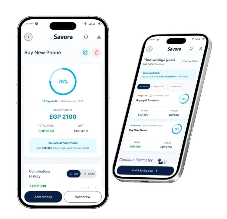
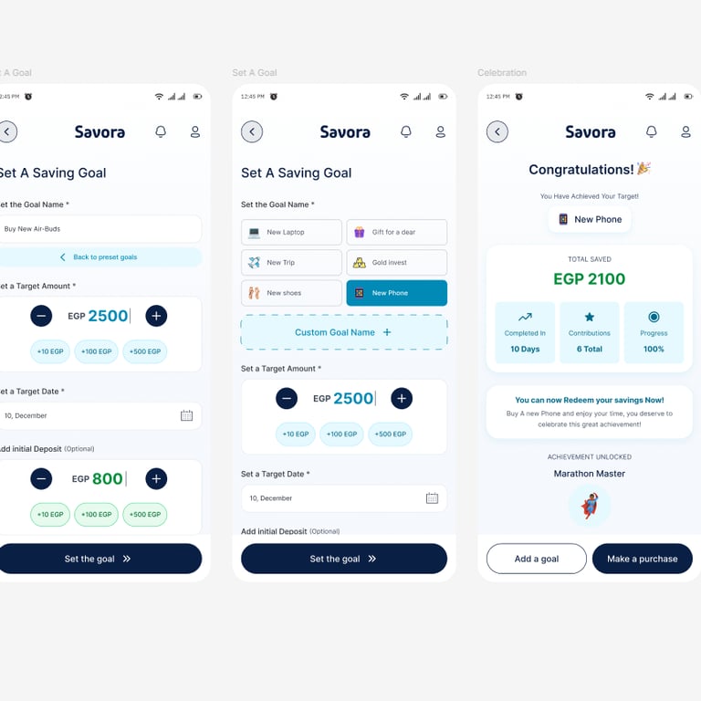
Savora platform has been working on a new feature: "Savings Goals" which is about allowing users to set aside money from their available spending limit for future planned purchases (like holiday shopping, home renovation, or a big electronics purchase).
Project Overview
Role: Product Designer
Tools Used: Figma MAKE, Figma, Miro, Claude
Duration: 1 month
Savora platform has been working on a new feature: "Savings Goals" which is about allowing users to set aside money from their available spending limit for future planned purchases (like holiday shopping, home renovation, or a big electronics purchase).
Phase 1: Structuring main Users tasks
Structuring the user-flow and main tasks
My Goal for this phase was to understand the main flow of the feature and how to optimize the app screens for this feature.
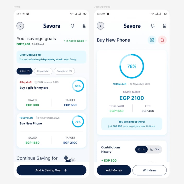
What users can do:
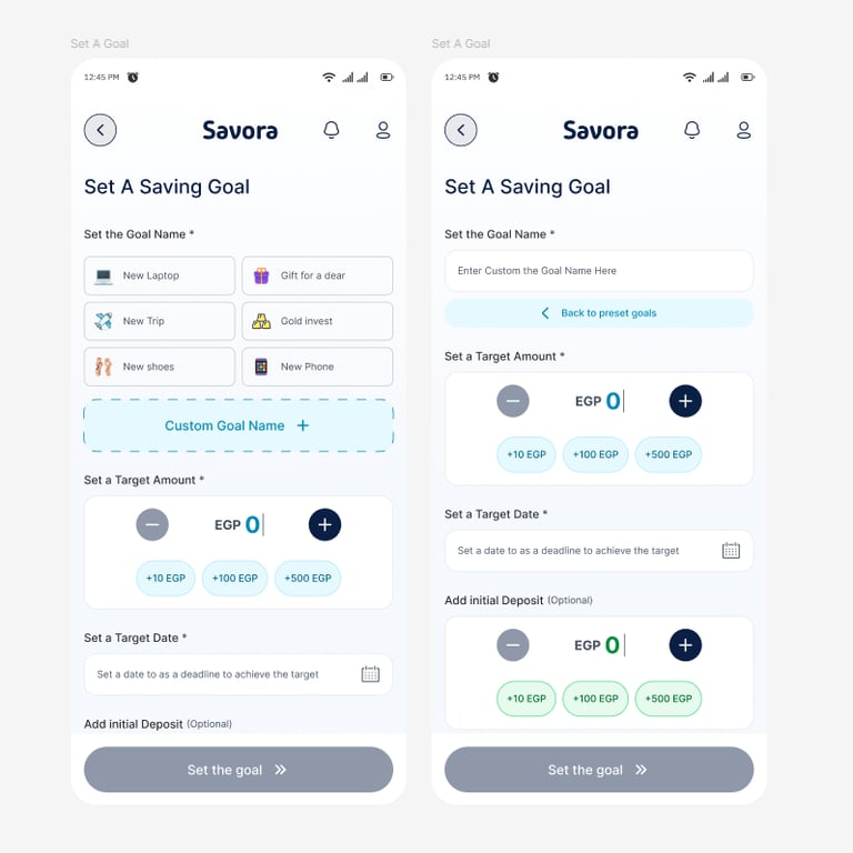
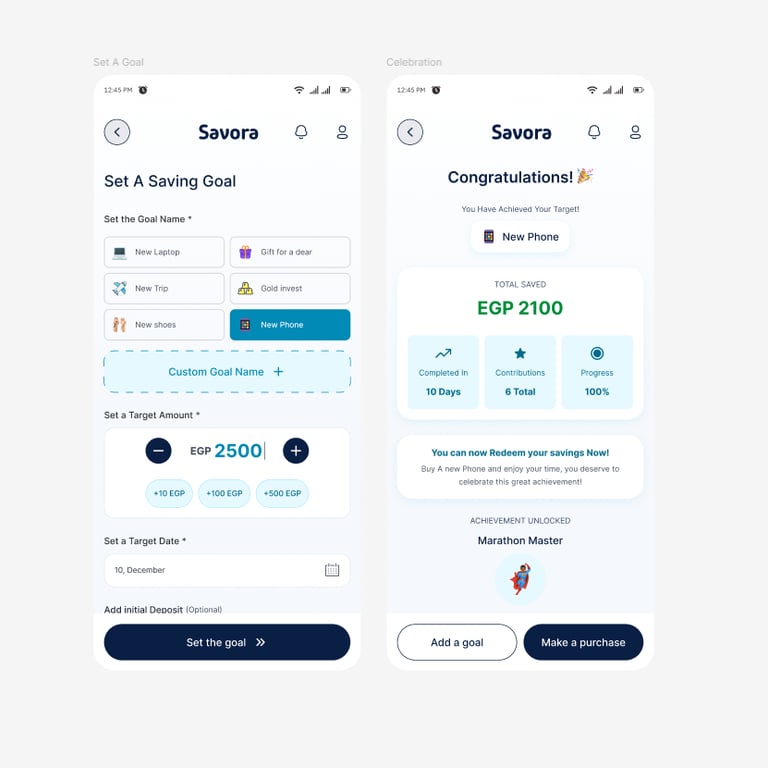
Create a savings goal with a target amount and date
Lock away a portion of their spending limit toward this goal
Track progress as they add money over time
Use the saved amount when they're ready to make the purchase
Phase 2:
Research competitors
Making competitive Audit & UX Research
Reviewed some local direct and indirect competitors like:
Thndr
InstaPay
Telda
Made careful review, documented pain points & strengths & UX similar flows
Phase 3:
Outlining main considerations
Main considerations before the start
UX Considerations:
Thumb-friendly zones (For main CTAs accessibility)
Appropriate input methods (Make it easy & fast to input)
Efficient use of screen space (For covering all of the main tasks)
Logical information hierarchy
Real-world Considerations:
Think about:
How does this feel for someone saving for something exciting vs.
stressful?
What if someone is at 99% but can't quite reach their goal?
How do you make progress feel tangible and motivating?
What safeguards prevent accidental withdrawals?
Phase 4:
Updating the design system
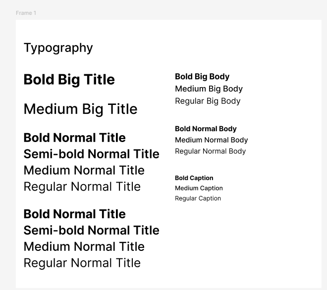
Adding more variations for the Typography and the brand colors
For the Typography:
I established a scalable typography system ranging from 12px to 28px, ensuring accessibility and visual hierarchy across different screen sizes.
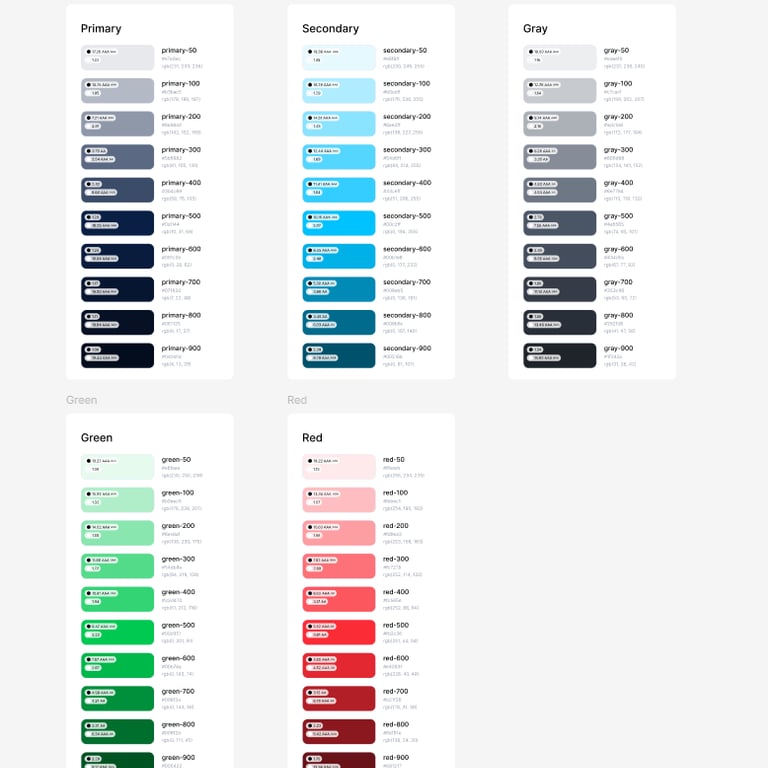
For the Color Palette & Shadows:
I introduced an additional blue tone to complement the main brand color. The new shade reinforces trust and reliability, aligning with the product’s identity and enhancing the feature’s sense of financial confidence.
Phase 5:
Start Designing
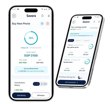
On updating the main necessary design system components, I've moved to start designing the UI
Conclusion
This project reflects my approach to balancing design clarity, business identity, and practical constraints. My priority was to ensure the UX foundation and visual hierarchy were solid before extending into richer interactions and animations.
Reach out to me!
Expect to hear from me 2 days after submitting the contact form or sending me an email. Excited to work with you :)
mahmoudessamsalm@gmail.com
Mahmoud Essam
Crafting exceptional user experiences that balance between users' and business needs.
CONTACT
mahmoudessamsalm@gmail.com
© 2025. All rights reserved.